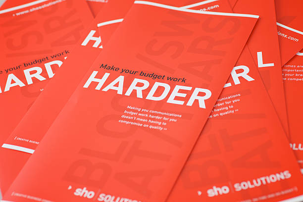
Brochures are an essential marketing tool for businesses to promote their products or services. Choosing the right brochure style can significantly impact engagement with your target audience and the effectiveness of your marketing campaigns. Two popular brochure options are the BiFold Brochure and TriFold brochures. In this article, we will delve into the pros and cons of each type, helping you make an informed decision for your business. So let’s explore the differences between BiFold and TriFold brochures and understand their advantages and disadvantages.
Key Takeaways:
- BiFold and TriFold brochures are popular options for businesses to promote their products or services.
- Understanding the pros and cons of each type can help you make an informed decision for your business.
- BiFold brochures offer simplicity and elegance, while TriFold brochures are compact and efficient.
- Consider the design considerations, content delivery, and audience engagement when choosing between BiFold and TriFold brochures.
- Analyze the production costs and logistical considerations to determine the most suitable brochure style for your business.
Introduction to the BiFold Brochures as a Marketing Tool
Brochures are a crucial marketing tool for businesses looking to promote their products or services. They serve as tangible, informative pieces that allow companies to effectively communicate with potential customers. With their visually appealing design and engaging content, brochures play a significant role in capturing the attention of target audiences and driving business growth. In this section, we will explore the importance of brochures in business promotion, highlight the factors to consider when selecting the right brochure style for target engagement, and discuss how different brochure formats contribute to maintaining brand image consistency.
The Importance of Brochures in Business Promotion
Brochures are a versatile and widely used tool for business promotion due to several reasons. Firstly, they provide a tangible form of communication that allows potential customers to physically interact with the brand and its offerings. Unlike digital marketing materials, brochures can be easily stored, shared, and referred to at a later time, making them a lasting reminder of a business and its value proposition.
Secondly, brochures offer a comprehensive platform for conveying information about products or services, company background, and relevant details. They allow businesses to present their offerings in a visually appealing and organized manner, enabling potential customers to easily understand and engage with the provided information. Moreover, brochures can effectively communicate complex concepts through concise and engaging content, making it easier for customers to grasp the key messages.
Lastly, brochures act as a personalized and targeted marketing tool. By distributing brochures to a specific target audience, businesses can reach potential customers directly and tailor the content to their specific needs and interests. This targeted approach enhances the chances of capturing the attention and interest of potential customers, ultimately increasing the likelihood of conversion and driving business growth.
Selecting the Right Brochure Style for Target Engagement
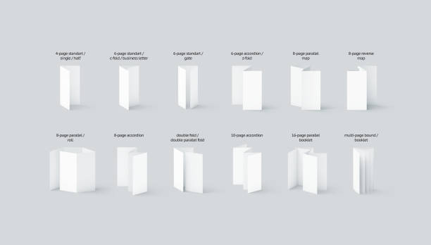
When it comes to selecting the right brochure style for target engagement, businesses must consider various factors. These factors include the characteristics of their target audience, the nature of their products or services, and the overall marketing objectives. By aligning the brochure style with these factors, businesses can maximize the impact of their marketing efforts and achieve desired outcomes.
For instance, if the target audience comprises professionals in a corporate setting, a sleek and professional-looking brochure style, such as a Bi Fold brochures, may be more popular choice. On the other hand, if the target audience consists of creative individuals, a more visually engaging and unique brochure style, such as a TriFold brochure, may be more effective in capturing their attention and interest.
Additionally, businesses should consider the purpose of the brochure and the desired level of engagement. For example, if the aim is to provide detailed product information, a brochure style that allows for more content, such as a TriFold brochure, may be more suitable. Conversely, if the objective is to create a visually impactful and concise introduction, a BiFold brochure might be the better choice.
Varied Brochure Formats and Brand Image Consistency
It is essential for businesses to maintain brand image consistency across all marketing materials, including brochures. Consistency in design elements, color schemes, typography, and overall branding creates a cohesive and recognizable brand identity that fosters trust and familiarity among customers.
Fortunately, there are various brochure formats available that can be customized to align with a business’s branding guidelines and maintain consistency. Whether it be the choice of layout, color palette, or typography, businesses can adapt different brochure formats, such as BiFold or TriFold brochures, to reflect their brand image effectively.
By leveraging the diverse range of brochure formats and creatively incorporating brand elements, businesses can ensure that their brochures not only convey relevant information but also reinforce brand recognition and recall.
The Elegance of the BiFold Brochure
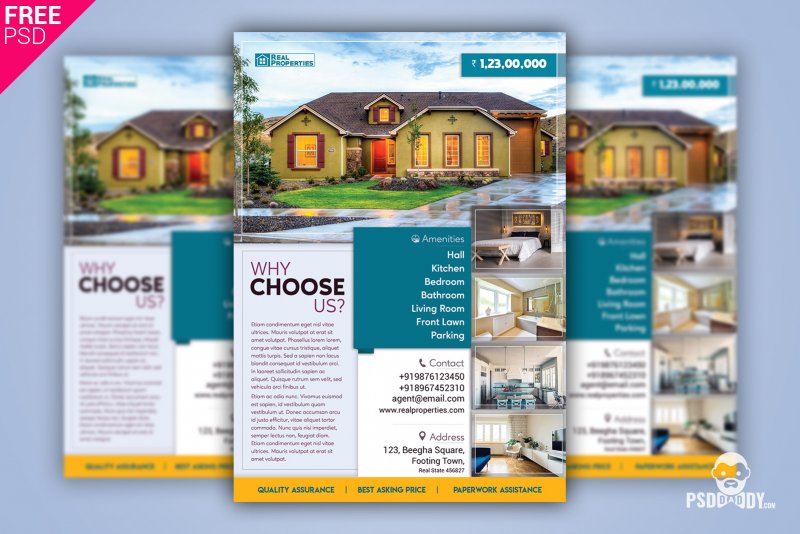
BiFold brochures are known for their elegance and simplicity. In this section, we will explore the design aspects and information presentation of BiFold brochures, highlighting the advantages they offer in business marketing.
Design Simplicity and Information Presentation
One of the key strengths of BiFold brochures is their design simplicity. With a single fold in the center, these brochures create a clean and organized layout that allows for easy navigation and content consumption. The simple fold also provides a seamless flow from one panel to another, ensuring a cohesive presentation of information.
In terms of information presentation, BiFold brochures offer a structured format that enables businesses to present their key messages effectively. The panels can be thoughtfully organized to guide the reader through the brochure, presenting information in a logical sequence that captures attention and encourages engagement.
Advantages of the BiFold Brochure in Business Marketing
BiFold brochures offer several advantages for business marketing:
- Versatility: BiFold brochures can be used for various purposes, including product showcases, event promotions, and company introductions. Their versatility allows businesses to adapt the brochure’s content and design to suit different marketing objectives.
- Cost-effectiveness: BiFold brochures are often more cost-effective than other brochure styles, making them a budget-friendly choice for businesses. They require less printing material and are easier to produce, helping businesses save on production costs.
- Ease of distribution: BiFold brochures are compact and easy to distribute, whether it’s through direct mail, in-store displays, or event handouts. Their convenient size makes them portable, ensuring that they reach the target audience efficiently.
The Impact of Visual Content in a BiFold Brochure
Visual content plays a crucial role in capturing the attention and engaging the audience. In BiFold brochures, visual elements such as high-quality images, infographics, and illustrations can significantly enhance the overall impact of the brochure.
By incorporating visually appealing graphics and imagery, businesses can create a visually stimulating experience for the reader, allowing them to grasp information quickly and effectively. Visual content also helps to break up text-heavy sections, making the brochure more engaging and visually appealing.
Examining TriFold Brochures for Compact Efficiency
Design Considerations for TriFold Brochures
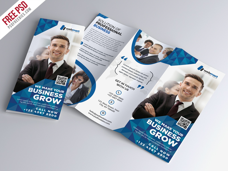
When it comes to TriFold brochures, careful design considerations are crucial. The layout and content organization play a significant role in maximizing the effectiveness of this brochure style. It is important to ensure that the design elements seamlessly integrate with the three panels, providing a visually engaging and coherent flow of information.
How TriFold Brochures Optimize Space for Content Delivery
One of the key advantages of TriFold brochures is their ability to optimize space for delivering content. With three panels available for information placement, businesses can strategically organize their content to ensure a comprehensive and engaging customer experience. It allows for a logical sequence of information, ensuring that key messages are communicated effectively to the reader.
The Strategic Use of TriFolds for Step-by-Step Unveiling
TriFold brochures offer a unique opportunity for step-by-step unveiling of content. By strategically placing information across the three panels, businesses can create a captivating experience for the reader. This approach allows for the gradual presentation of information, leading the reader on a carefully curated journey that builds anticipation and curiosity.
A Closer Look at Audience Engagement
Audience engagement is a crucial aspect of brochure marketing. In order to effectively reach and connect with your target audience, it is essential to understand the user experience and the impact of brochure layout on audience retention. In this section, we will compare the engagement factors of BiFold and TriFold brochures, examine their user experience, and explore the effects of brochure layout on audience retention.
Comparing BiFold and TriFold Brochures in User Experience
When it comes to user experience, both BiFold and TriFold brochures have their unique advantages. BiFold brochures offer a simple and elegant design that allows for easy viewing, easy to edit and quick accessibility of information. On the other hand, TriFold brochures provide a compact format that organizes content in a logical sequence, making it ideal for step-by-step presentations.
In terms of ease of navigation, BiFold brochures often have a single fold, making it easier for readers to navigate through the content in a linear fashion. TriFold brochures, with their three sections, can sometimes require more effort to navigate, as readers have to unfold and fold the brochure to access different sections.
Content visibility is another crucial aspect of user experience. BiFold brochures offer a larger canvas for displaying content, allowing for the inclusion of more visuals, images, and detailed information. TriFold brochures, with their compact size, require more strategic content placement to ensure optimal visibility and readability.
Overall, the user experience of BiFold and TriFold brochures depends on the specific goals and preferences of your target audience. Understanding their preferences and needs will help you choose the most engaging and effective brochure style for your marketing campaigns.
Effects of Brochure Layout on Audience Retention
The layout of a brochure plays a significant role in capturing and retaining the attention of your audience. A well-designed layout enhances readability, guides the reader’s flow, and increases the overall impact of the brochure.
When it comes to audience retention, easy navigation is key. A clear and logical flow of information share in both BiFold and TriFold brochures can help readers easily follow the intended message and retain important details. Proper sectioning, headings, and visual cues can aid in guiding the reader to the desired content and facilitate better engagement via your marketing designs.
The use of visuals and white space also greatly affects audience retention. Balanced use of images and text, along with sufficient white space, allows readers to digest information effectively and prevents overwhelming them with cluttered layouts.
In addition, the placement of important information in strategic areas of the brochure, such as the front cover, can significantly impact audience retention. Including compelling headlines, key benefits, and eye-catching visuals in these areas can capture attention and encourage readers to explore further.
Maximizing audience engagement requires careful consideration of brochure layout in terms of readability, content placement, and visual elements. By optimizing these factors, you can create brochures that effectively capture and retain the attention of your target audience.
| Factors | BiFold Brochures | TriFold Brochures |
|---|---|---|
| Design | Elegant and simple | Compact and organized |
| Navigation | Easier with a single fold | Requires unfolding for access to different sections |
| Content Visibility | More space for detailed information and visuals | Requires strategic content placement |
| Readability | Linear flow facilitates easy reading | Step-by-step presentation requires focused attention |
| Layout | Emphasizes easy navigation and balanced use of visuals and text | Utilizes strategic content placement and clear sectioning |
Design Challenges and Solutions for BiFold and TriFold Brochures
Designing brochures can present various challenges, but with the right solutions, you can overcome them effectively. In this section, we will explore the design challenges and provide solutions specific to BiFold and TriFold brochures. We will discuss how to overcome design limitations in different brochure styles and offer tips for utilizing templates to streamline the brochure creation process for effective design execution.
Overcoming Design Limitations in Different Brochure Styles
Each brochure style, whether BiFold or TriFold, has its own design limitations. However, understanding these limitations is the first step towards finding creative solutions. For BiFold brochures, the main challenge lies in managing limited space, especially when conveying complex information. To overcome this, thoughtful content prioritization, concise copywriting, and strategic use of visuals can make a significant difference. On the other hand, TriFold brochures face limitations related to content continuity across folds. To address this challenge, designing a coherent visual flow and utilizing grids can help maintain consistency and enhance overall readability.
Utilizing Templates for Effective Brochure Creation
One effective solution for brochure design is utilizing templates. Templates provide a structured framework that simplifies the design process and ensures consistency across different brochure styles. They offer pre-designed layouts, typography choices, and placeholder content, allowing you to focus on customizing the design to suit your specific needs. When you download templates, you can save time and effort, while still creating visually appealing and engaging brochures. There are numerous online resources that offer free and premium brochure templates, catering to different industries and purposes. So take advantage of these design resources to streamline your brochure creation process and achieve effective design execution.
Logistical Considerations for Brochure Distribution
Brochure distribution is another crucial aspect to consider. Here are some logistical considerations you should keep in mind:
- Mailing costs: Calculate the costs associated with mailing your brochures to your target audience or clients.
- Storage requirements: Determine the space and resources needed to store your brochures, considering factors such as quantity and size.
- Delivery methods: Explore different delivery methods, such as mail, hand-delivery, or partnering with distribution services, to ensure your brochures reach the right recipients efficiently.
Representing Your Brand with BiFold Brochures
A BiFold brochure provide a unique opportunity to effectively represent your brand. In this section, we will explore how BiFold brochures can be used to showcase your brand identity and values. Through thoughtful design elements, color schemes, and imagery choices, you can create a cohesive and impactful representation of your brand in BiFold brochures.
Conclusion
After exploring the pros and cons of BiFold and TriFold brochures, it is clear that both options offer unique advantages for businesses. When choosing between these two brochure styles, consider your specific marketing goals and target audience, as well as your budget and logistical requirements.
BiFold brochures provide elegance and simplicity, making them versatile and cost-effective. They are ideal for conveying essential information and showcasing visual content that engages the audience. Additionally, BiFold brochures offer an excellent opportunity to represent your brand effectively, aligning with your brand identity and values.
On the other hand, TriFold brochures are known for their compact efficiency and optimized content delivery. With the strategic use of step-by-step unveiling, TriFolds create a captivating experience for the reader. Their design considerations allow for easy organization of information and make efficient use of limited space.
In conclusion, carefully evaluate your business needs and preferences when choosing between a BiFold Brochure and TriFold brochures. Consider the pros and cons highlighted in this article to make an informed decision that aligns with your marketing objectives. Remember, your brochure style plays a significant role in engaging your target audience and enhancing the effectiveness of your marketing campaigns.
